1. Han was pushed into the track by a passerby and wasn't able to pull himself out. when the photographer came by he tried to use the flash and warn the train and didn't try to help him out. the photographer was able to take the photo because he didn't help out the poor man.
2. the photographer said he took the photo to use the flash in order to stop the train and hopes that the train would see it.
3. no i don't think the photographer should have taken the photo. He should have tried harder to lift the guy out of the train track.
4. The photographer could have done more to help Han. He could have gotten more people to help or tried harder to lift him out. Han died and the photographer just stood there and took a picture.
5. I disagree with their decision to put it on the page because Putting the photo on the front cover makes the situation sound like it was okay to chose a photo over life.
6. to a photojournalist capturing the images of life as it happens is probably more important because thats their job. If they tried to stop all bad situations from happening then there would be no pictures of the terrible stuff because they would be too busy tying to put an end to all the bad things.
7. There are self-portraits where the photographer is in the photo him/herself. but in photojournalism the photographer is trying to capture life as is and not inter fear.
8. No i think if a situation like this happens where its a life or death situation then they should help first and then maybe try to photograph it. I think this would have been a much more powerful image if the photographer got someone else to lift Han out and then shot the saving of his life.
9. I still think the photographer should have tried harder to get the guy out and shouldn't have got the photo at all.
Thursday, December 18, 2014
Thursday, December 11, 2014
review for final

Jesse Golding twirls in her dress for her cousin's wedding in their hotel room in Alaska this morning before the wedding. The wedding was delayed because of today's blizzard, the coldest in Alaska's recorded history.
1. Rule of thirds- when the subject is placed in the third of the page
2. Balancing Elements- when the subject is balanced out by the other objects on the page
3. Leading Lines- when lines in the photo lead the viewer's eye to the subject
4. Symmetry and Patterns (repetition)- when things in the photo are repeated
5. Viewpoint- when the view point is changed rather than at eye level
6. Background- when the background is simple and doesn't distract from the
7. Create depth- when objects overlap and you can see layers creating depth
8. Framing- when the
9. Cropping- when the photo is zoomed in and doesn't show much background
10. Mergers and avoiding them- paying attention to the background and colors so that the
Aperture- pupil. changes the size of the opening
Shutter Speed- changes the speed of the opening and how long it states open. like blinking
ISO- makes the photo more grainy. more noise in the photo. bigger numbers let faster shutter speeds
ethics
Its okay to change the colors in levels or crop the photo as long as the meaning and reality of the photo doesn't change. Its not okay to add, change, combine or take away the stuff in the actual photo. this manipulates the viewers idea of what really happened.
environmental- A photo that shows someone interacting with their environment
self - a portrait that is taken by the photographer of the photographer
casual - A portrait of someone acting casual. usually not looking at the camera
exposure- amount of light that reaches the film/sensor. effected by aperture, shutter speed and the amount of light
depth of field - distance between the farthest objects in the photo and what appears to be in focus
focal length- how far the camera can zoom in with its lens
magazine covers
early- simple like a book cover, black and white
poster- writing was separate from photo
married to type- words overlapped photo but didn't inter fear with subject
forest of words- words overlapped subject and tried to get your attention
Monday, December 8, 2014

Wednesday, December 3, 2014
magazine cover
no matter what you put on the cover, keep the six functions of covers in mind:
1. Familiar recognition from issue to issue (that’s the brand)
2. Emotionally irresistible (that’s the image’s appeal)
3. Arousing curiosity (that’s to pull the casual glancer in)
4. Intellectually stimulating, interesting (that’s to promise benefits)
5. Efficient, fast, easy to scan (that’s showing off the service)
6. Worth the investment of money and time (that’s the “What’s in it for me?”)
Best covers
1 formal
2 informal
3 environmental
4 environmental
5 informal
6 formal
7 informal
8 formal
9 formal
10 formal
11 formal
12 formal
13 informal
14 formal
15 formal
16 informal
17 informal
my favorite cover

Winner
Sports Illustrated, April 22, BOSTON
Photographer: John Tlumacki
"At approximately 3:10 on the afternoon of April 15, 2013, the editors of Sports Illustrated returned from their Monday meeting to rumors of a terrorist act near the finish line of the Boston Marathon. With fewer than four hours until Si's weekly deadline, producing a definitive news account of what happened was impossible. Was there, however, an image that captured the afternoon's chaos, its tragedy, in addition to a city's capacity for resilience and goodness in the face of such terror? Yes, there was, dozens of images, in fact. By 4:30 p.m., half an hour ahead of the magazine's usual cover deadline, (Read More)
"At approximately 3:10 on the afternoon of April 15, 2013, the editors of Sports Illustrated returned from their Monday meeting to rumors of a terrorist act near the finish line of the Boston Marathon. With fewer than four hours until Si's weekly deadline, producing a definitive news account of what happened was impossible. Was there, however, an image that captured the afternoon's chaos, its tragedy, in addition to a city's capacity for resilience and goodness in the face of such terror? Yes, there was, dozens of images, in fact. By 4:30 p.m., half an hour ahead of the magazine's usual cover deadline, (Read More)
- See more at: http://www.magazine.org/asme/magazine-cover-contest/past-winners-finalists/2014-winners-finalists#sthash.cNBZZZcA.dpuf
The fallen runner and the police men with their guns drawn show the suspense and tension of the moment. The smokey background and show that the bomb just went off and the chaos of the moment. The photo shows movement of the officers as they rush to find who set the bomb. Also it shows the shocked marathon runner in the center of the tragedy. The viewer is left with the same sense of chaos that was present during the time. The way the photographer was able to present the feelings and atmosphere in a single photo is amazing. I also like how the policemen are in front of the magazine brand. this gives the photo a sense of depth like the people are coming off the page at you grabbing your attention. The composition of the photo gives the photo a cool and unique angle of what is happening.
magazines part 2
1. early magazine covers
The early magazine covers were simple, black and white paper covers with black and white drawings. they look kind of like simple book cover with just a title. The magazines are more decorative than to foreshadow what is in the magazine. in 1844 the pictures start to interact a little with the drawings. in the late 1800 the magazines started to incorporate designs and more interaction with the drawings.
the poster cover
pictures that need no words. there were drawings in color that depicted a certain mood or season. Most didn't have anything to do with the inside of the magazine at all. they were looked to be posters with different fonts and color. mainly artwork and paintings were on the covers. very artsy. The covers had cover lines and were done by famous artists. some were abstract and some were very realistic. the first photographs also appeared on the covers.
Pictures married to type
these covers were very aesthetic and very artistic. cover lines were common in some and some were very symbolistic. the design of the drawing mixed with the words and over lapped a little. In some the letters are part of the photo. some magazines tried to incorporate the idea of nature settings and had depth and movement. the color and depth of the cover was meant to pull you in. lots of beauty magazines used this method and they became more busy with words and colors.
In the forest of words
these covers were photos advertising every thing in the magazines. the text overlapped the subject allot an distracted form the actual photo. lots of colors were used to draw in the viewer and lots of things going on. these covers were very busy with lots of texts and fonts and different colors.
Tuesday, December 2, 2014


Friday, November 21, 2014
fashion
video 1
lips bigger, head raised, eyes lowered, hair moved around, neck lowered, eyes enlarged, head smaller
video2
lips redder, nostrils rounder, eyes bigger, eyes lighter, sholders raised, skin lighter, thinner arms, stomach lifted, legs longer, calfs smaller, feet arched, arms longer, head raised, thinner face, thinner neck, thinner legs, lighter skin and hair, butt lowered,
video 3
butt smaller, legs smaller, stomach smaller, arms thinner, thinner all together, more hair, even more hair, even thinner, even thinner, legs thinner, arms smaller, shoulders more relaxed, thinner, more hair, even thinner.
4. It is not ethically okay to change a person's appearance like in these videos. It totally changes the viewer's perception of the photo to know that the model has been changed so much. The manipulation of these photos is crazy gross and since most people will just see the after picture they are being manipulated in to thing the models actually looked like that.
5. In beauty and makeup advertising this would be very unethical because they are manipulating their customers into thinking that the product was what made the model look the was she does when really it was photoshop, fake.
6. changes that don't change the subject or the content or the message of the original photo like lighting or color of the whole photo are okay but when the actual subject gets changed like what happened in the videos it is very un ethical.
7. In fashion photography the photos are trying to show beauty even if they have to manipulate the photos to do so. In photojournalism the photos are trying to tell a story.
8. In fashion photography a lot of the photos are very far from reality making the photos very unethical. In photojournalism most of the photo show reality so the photos are ethical.
9. you are showing us these photos to show what not can do and how some photos are very unethical.
10. None of these photos are of guys because women are a lot more pressured to look like a model.
Wednesday, November 19, 2014


Monday, November 10, 2014
the most powerful image in this photo is this one because it shows that it is hard to be in the army and people do get hurt.
 Set #1 At home in Denver - 1-7
Set #2 At Basic Training - 8-46
Set #3 In Iraq - 51-70
Set #4 Back in Denver - 71-82
the set of images where he was in Iraq was the most powerful because it showed him feeling homesick and actually in the war and being part of the war.
the images tell a story together by showing different events and changes in his life in chronological order.
present tense
the captions enhance the photo by giving a little more information about what is going on in the photo. this gives the viewer a deeper understanding of the photograph or a different view of the photo.
Thursday, November 6, 2014
rules of photography part 2
1. Rule of thirds

2. Balancing Elements

3. Leading Lines

4. Symmetry and Patterns (repetition)

5. Viewpoint

6. Background

7. Create depth

8. Framing

9. Cropping

10. Mergers and avoiding them - here I want you to find me a COOL merger photo.
2. Balancing Elements
3. Leading Lines
4. Symmetry and Patterns (repetition)
5. Viewpoint

6. Background
7. Create depth
8. Framing

9. Cropping
10. Mergers and avoiding them - here I want you to find me a COOL merger photo.

Wednesday, November 5, 2014
portraits
16. Take Unfocused Shots
As photographers we have ‘sharp focus’ drummed into us as an ultimate objective to achieve in our work – but sometimes lack of focus can create shots with real emotion, mood and interest.
There are two main strategies for taking unfocused images that work:
1. Focus upon one element of the image and leave your main subject blurred. To do this use a large aperture which will create a narrow depth of field and focus upon something in front of or behind your subject.
 Photo by Jeff Kubina
2. Leave the full image out of focus. To do this again choose a wide aperture but focus well in front or behind anything that is in your image (you’ll need to switch to manual focussing to achieve this).
These kinds of shots can be incredibly dreamy and mysterious.
 Portrait by peskymac
20. Find an Interesting Subject
I have a friend who regularly goes out on the streets around Melbourne looking for interesting people to photograph.
When he finds someone that he finds interesting he approaches them, asks if they’d pose for him, he quickly finds a suitable background and then shoots off a handful of shots quickly (if they give him permission of course).
The result is that he has the most wonderful collection of photographs of people of all ages, ethnicities and backgrounds.
While many of us spend most of our time photographing our loved ones – perhaps it’d be an interesting exercise to shoot interesting strangers once in a while?
 Portrait by .mushi_king
A mirror or some other reflective surface offers an even easier way to take a self-portrait. In most cases, the camera will be included in the scene (but this can help make a statement about your enthusiasm for photography). You can use your camera as a prop, and hold it away from your face. When you photograph into a mirror, be sure your reflection is in focus. An infrared autofocusing system will usually focus on glass if it's aimed into a mirror, and will focus at infinity if aimed at an angle. You might try focusing at an object that's the same distance as the distance from the camera to the reflection, lock in the focus, recompose the image to include yourself, and take the picture.


I like these environmental portraits because show the person interacting with their environment. Also they are well photographed and use some of the rules of photography and rules of portraits.
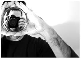

I like these self portraits because thy show the photographer in a weird way through the camera. they both use the rule of thirds and the rule of simplicity.


I like these photos because its just people acting natural and casual. they both use rule of thirds and lines.
my portraits will be of random people using the rules of photography, what i know about iOS, aperture, and shutter speed to get the best quality photo, and rules of portraits.
Monday, October 27, 2014
aperture shutter speed and IOS
1. the aperture is related to the pupil
2. the smaller the aperture the larger the f-stop, the higher the aperture the smaller the f-stop.
3. the smaller f-stop or larger aperture will bring out the foreground from the background by making the foreground in focus and the background blurry. the area in focus is the depth of field and that changes with the aperture size, bigger aperture (smaller f-stop), the smaller depth of field. slow shutter speed
 fast shutter speed

2. the smaller the aperture the larger the f-stop, the higher the aperture the smaller the f-stop.
3. the smaller f-stop or larger aperture will bring out the foreground from the background by making the foreground in focus and the background blurry. the area in focus is the depth of field and that changes with the aperture size, bigger aperture (smaller f-stop), the smaller depth of field.
slow shutter speed fast shutter speed
1.
a. 1/150
b. 1/160
c. 1/350
d. 1/350
e. 1/250
f. 1/300
a. 1/50
b. 1/50
c. 1/350
d. 1/150
e. 1/100
f. 1/200
2. aperture priority: shutter speed is automatic but aperture is manual
shutter priority: shutter speed is manual and aperture is automatic
manual: both shutter speed and aperture are set automatically
1. with a higher IOS the shutter speed can be faster
2. when there is lots of light, use the lowest IOS
3. when there is not enough light increase the IOS
aperture settings
2.8, 4, 5.6, 8, 11, 16, 22,
shutter speed
1, 1/160, 1/4000
IOS
100, 200, 400, 800, 1600, 3200, 6400, 12800, 25600,
Thursday, October 23, 2014
love loss and beauty- battling breast cancer
These photos were very touching and made me very sad for the woman. It showed the transformation of the woman's life as she went through the struggle for survival. This made me feel very special that her husband share their story with everyone.
"These photographs do not define us, but they are us."
this means that the photos are the life they went through. They describe and show the feelings they went through when she had breast cancer.
I honestly don't think I could take photos like this if I was really close to someone with cancer. I think I would be too sad to think about capturing the beauty of the sadness.
Dear Angelo,
Your photos of your wife battling cancer are so touching. Thank you for sharing them with everyone. It was really moving to look through the photos. I'm sorry for your loss.
Tuesday, October 14, 2014
Africa/abandoned theme parks
I was very impressed on how close he got to the animals. His photos were so in focus and showed depth and movement. I was also suppressed that it took him 18 days to get a picture of a lion and weeks to get on of the giraffes. His photos were very inspiring.
 In the black and white photo there is a man kneeling down holding two big elephant tusks next to his head in the bottom third of the photo. The photo shows the plain desert landscape and the sky. I like this photo because it makes the viewer feel like the man feels bad for killing the elephant because of the way he is crouched down. The elephant, a huge animal compared to the man, seems so important because by looking at the photo it looks as if the tusks are bigger than the man.
The rule of simplicity is used because the background is just the plain flat land scape and the sky. This puts all the focus on the man and the tusks. the rule of thirds is present because the man is in the bottom left of the photo.
He uses a Pentax 67II with only two fixed lenses. He doesn't use zoom lenses because he wants to capture the spirt of the animals.
Brandt is dedicated to conserve Africa's wildlife and ecosystem
the animals came first, photography second. Photography was merely the best medium for me to express my feelings about animals, and the natural world.
Nick Brandt


other unusual photo ideas
unusual buildings
the moon
volcanoes
caves
weird cars
Neil Armstrong was the first to take photos on the moon.

The rule of simplicity is used because the background is just the plain flat land scape and the sky. This puts all the focus on the man and the tusks. the rule of thirds is present because the man is in the bottom left of the photo.
He uses a Pentax 67II with only two fixed lenses. He doesn't use zoom lenses because he wants to capture the spirt of the animals.
Brandt is dedicated to conserve Africa's wildlife and ecosystem
the animals came first, photography second. Photography was merely the best medium for me to express my feelings about animals, and the natural world.
Nick Brandt
Shidaka’s Utopia, Beppu, Kyushu, Japan
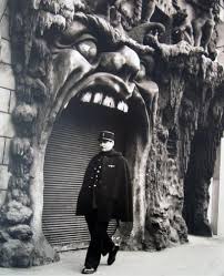
I think this would be an interesting place to visit because it is a mystery why the park shut down and every thing is left as it was like being frozen in time. and in the house of horrors the creepy monsters decay.
other unusual photo ideas
unusual buildings
the moon
volcanoes
caves
weird cars
Neil Armstrong was the first to take photos on the moon.
It would be fun to take photos of the moon's land scape because not many people have seen very many photos of the moon. It would be interesting to get a different perspective for he moon. On the moon you could take pictures of craters and other land elements of the moon.
It would take a rocket to take pictures at my location. you would also have to be a trained astronaut and have a fancy space suit and everything. Also you would have to become friend with NASA and have them help you out. not to mention the crazy expenses of a rocket and the fuel and everything. And the planning and coordination of all the people you would need to be involved would take a lot of work. you would also need a camera that would work on the extreme heat and cool of the moon. I don't think the main purpose of going to the moon should be just to take photos. It would take a lot of work and seems kind of pointless to go to the moon in order to just take photos.
academic shoot reflection and critique
1. It was challenging to get good pictures while they were moving around in their classrooms and trying to apply the rules of composition to the photos while shooting.
2. I was trying to get unique angles while shooting, like in my picture of framing with the girl sewing the bowl, I knelt down and got a photo from that angle
3. Next time I would try to get my photos in better focus and have simpler backgrounds.
4. I would still think about the rule of thirds, balance and framing like I did well in this photo shoot.
5. Next time I think rule of thirds will be easiest to accomplish
6. for me I think the hardest to accomplish would be the rule of simplicity because when I'm taking photos I am not really thinking about keeping the background simple.
7. The rule of lines is the one I'm confused on but I could try to take more photos where lines lead your eye to the subject.
http://morgansphotojournalismblog.blogspot.com/2014/10/academic-shoot.html
Monday, October 13, 2014
funny captions

MaryAnn Killson wakes up the neighborhood with the shot of her rifle as she shoots the raccoon that dug up three of her cabbages in her garden at 1:23 yesterday morning. MaryAnn is known never to be with out her handy rifle, Henry, named after her pit bull she had when she was twelve.

Its Bobby Boy's 101st birthday and the 101 candles on the cake set fire to the 123 year old roof of Mr. Bobby Boy's house, calling the fire trucks to the oldest building in the town. No one was hurt and the damage on the house is nothing major but Bobby was very disappointed that he wasn't able to finish making his 101st birthday wish.

Donald Bernie's dog, Sir Barkly, saves Donald's 2 year old grandson, Tommy, from the boy's fatal allergy to beestings by eating the bees when they flew near the grandson when they were at the park lastu Tuesday. Sir Barkly had a very sore mouth until yesterday when he was able to eat his favorite meal that Donald specially prepares for him, honey stew.
Wednesday, October 8, 2014
academic shoot
balance

1. I followed the rule of balance pretty well. There are two people on either side of the picture and they balance each other out.
2. the subject is the hands on the keyboard.
3. When looking at the picture it is pretty clear that the subject is the hands.
4. It could be clearer if the background was simpler.
framing

2. the subject is the string that is being sewed by the hands through the bowl.
3. yes it is clear that the subject is the string that is being sewed by the hands through the bowl.
4 It could be clearer if the there wasn't any yellow in the background and on the table.
lines

2. the subject is the computer closest to the camera.
3. yes it is clear that the subject is the computer because it takes up the picture and is in focus.
4. I could have included the rule of lines better by having more lines in the background that lead your eye to the subject.
rule of thirds

2. the subject is the baseball that is being painted
3. It is clear that the baseball is the subject, but if the background was simpler and the ball was in better focus then it would be more obvious what the subject is.
simplicity

2.the subject is the hands working with the clay.
3. yes it is clear what the subject is.
Tuesday, October 7, 2014
great black and white photographers part 3
1. When I first saw Robert Doineau's photos I thought they were funny. I liked the way they told a story through the photo and the humor. I also really liked how the photos were composed.
 .
.
2. I see a bunch of children racing under the Eiffel tower. Their smiling faces show their happiness. They skip and dace for joy as they speed down the streets of Pairs. Their hair flies back in the wind and their arms swing out as they leap for joy.
I smell the children's smelly sweat.
I hear the sound of their foot steps as as the stampede charges past .
I taste the dust they kick up from their shoes flying by.
I feel the joy of the children's free sprits and youth.
photo mural prject
life at bowie could be a theme of the mural. The mural would be a quilt work of photos that represent bowie. Cameras and phone cameras could be used to take the pictures because then there would be more photos to choose from. One place to put the photo that would be cool is in the pit in the courtyard. If the photos were on the ground then the students could interact with the photos and every one who passed by the pit would see the mural. And it would be cool if the mural was so big that it took up the entire pit.
Thursday, September 25, 2014
unusual and interesting photos
Christian's photos are very weird. they are very abstract and confusing. I think he created these photos by layering the photo in different angles. Some buildings that would be cool to do this to would be some of the sky scrapers downtown, such as the capital building and the frost building. To get access to these buildings you could go downtown and take a photo of them.


part 2
I thought this photo was interesting because I liked the way the photographer showed the girl in a reflection. I found this photo in the portrait and personality category and it won 2nd place. The photographer used the rule of thirds to place the girl and a simple background. I think that is some of the things the judges saw when they picked this photo. The photographer had to take the photo of the reflection without getting the camera in the photo and they also had to get the right lighting in order to get the shadow of the tree over her face.
This photo stood out to me because it showed to powerful longing for a loved one lost a war. I found this photo under the category returning veterans, coming home, and the photo won first place. the photographer used lines to draw your eye to the woman. Also the lines are at an angle so it is more visually interesting and showed that the lines go somewhere. I think this is partly what the judges were looking at and also probably how the photo is black and white, creating a very sad and gloomy mood. the photographer had to find a sad scene and angle the camera so that the background was just the wall of names.
I picked this photo because it shows a heroic scene where the rescue crew is saving a guy from a fallen log in a flood. this photo was int he domestic news single category and won 3rd place. what got my attention was the movement of the water and the danger of what was happening. I think the judges were probably looking at the balance of the people and the colors. the photographer had to be with the rescue crew at the right place at the right time in order to get the photo.
part 3
part 3

the advice to take from this drawing was to take a picture of a portrait, a hand, a reflection and show perspective. the photo I found shows all of these elements except for the hand.
Subscribe to:
Posts (Atom)